


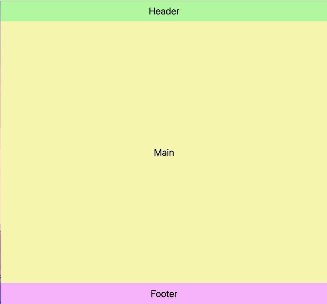
A pancake stack or sticky footer layout is a pattern where the footer "sticks" to the bottom of the viewport when content is short and when content extends beyond the viewport, the footer sits at the bottom of the content.
This layout pattern can be achieved using flexbox or CSS Grid layout mechanisms.
First, let's create the HTML markup:
<div class="container">
  <header>Header</header>
  <main>Main</main>
  <footer>Footer</footer>
</div>
Using CSS Grid
Next, we need to create a grid that will have one column and three rows. We can do this by adding grid: display to the .container class.
.container {
  display: grid;
}
Next, we need the header and the footer to be as tall as the content in them and the main to grow to fill any remaining space. This can be achieved using grid-template-rows: auto 1fr auto;.
.container {
  display: grid;
  grid-template-rows: auto 1fr auto;
}
- grid-template-rows species the sizing and distribution of the rows in a grid.
- auto specifies the height of the row should grow/shrink based on the height of the content within it.
- 1fr specifies the row should occupy one unit of available space. In our example, it will grow to fill any remaining space since it is the only row with a
1frunit.
Finally, we need the container to be as tall as its parent so we set its height to min-height: 100%. If its parent is the body then we set it to min-height: 100vh.
.container {
  display: grid;
  grid-template-rows: auto 1fr auto;
  min-height: 100vh;
}
Using FlexBox
First, we need to create a flex formatting context and set its main axis to vertical which will lay out the children vertically:
.container {
  display: flex;
  flex-direction: column;
}
Next, we need the header and the footer to be as tall as the content in them and the main to grow to fill any remaining space. This can be achieved using flex-grow, and flex-shrink properties.
header, footer {
  flex-grow: 0;
  flex-shrink: 0;
}

main {
  flex-grow: 1;
}
- flex-grow specifies the ability of a flex item to grow relative to other flex items. Giving it a value of 0 causes it to maintain its initial size.
- flex-shrink specifies the ability of a flex item to shrink relative to other flex items. Giving it a value of 0 causes it to maintain its initial size.
In our example above, header and footer will be as tall as their content, and main will grow to fill any remaining space.
Finally, we need the container to be as tall as its parent so we set its height to min-height: 100%. If its parent is the body then we set it to min-height: 100vh.
.container {
  display: flex;
  flex-direction: column;
  min-height: 100vh;
}

header, footer {
  flex-grow: 0;
  flex-shrink: 0;
}

main {
  flex-grow: 1;
}